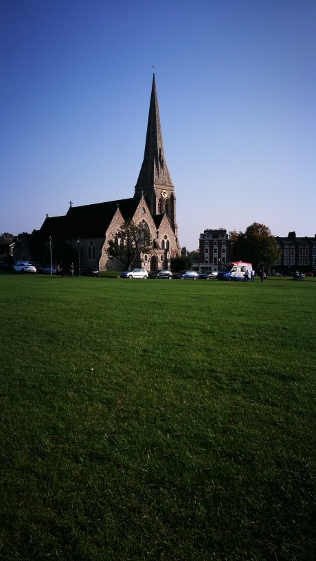
In Abstraction we focus on what makes a picture a certain level of abstraction, or how it is clearly separate from all of the other genres of photography. In this project my main focus will be to try to understand what the term 'Abstraction' fully means both in and out of photography.
The formal elements.
Photographers are usually aware of the ways in which they can create interest in their images beyond the simple fact of the subject. This is what separates good pictures and bad pictures of the same thing. The following list describes some of the abstract elements in any photograph. Below the list is an example of how you can analyse a photograph looking for these things specifically and how this helps to give the image meaning:
Focus: Which areas appear clearest or sharpest in the photograph? Which do not?
Light: Which areas of the photograph are brightest? Are there any shadows? Does the photograph allow you to guess the time of day? Is the light natural or artificial? Harsh or soft? Reflected or direct?
Line: Are there objects in the photograph that act as lines? Are they straight, curvy, thin, thick? Do the lines create direction in the photograph? Do they outline? Do the lines show movement or energy?
Repetition: Are there any objects, shapes or lines which repeat and create a pattern?
Shape: Do you see geometric (straight edged) or organic (curvy) shapes? Which are they?
Space: Is there depth to the photograph or does it seem shallow? What creates this appearance? Are there important negative (empty) spaces in addition to positive (solid) spaces? Is there depth created by spatial illusions i.e. perspective?
Texture: If you could touch the surface of the photograph how would it feel? How do the objects in the picture look like they would feel?
Value/Tone: Is there a range of tones from dark to light? Where is the darkest value? Where is the lightest?
Home Learning.
Photograms. |
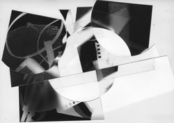
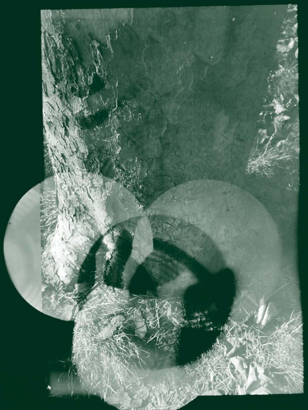
This was the first photogram I made cutting up than putting together random pieces of the same image.
At the start of the photogram project I wanted to make something quite simple and make one decision that changed how it looked completely different and stand out, which is why the whole image is near enough dark with an area that is most visible.
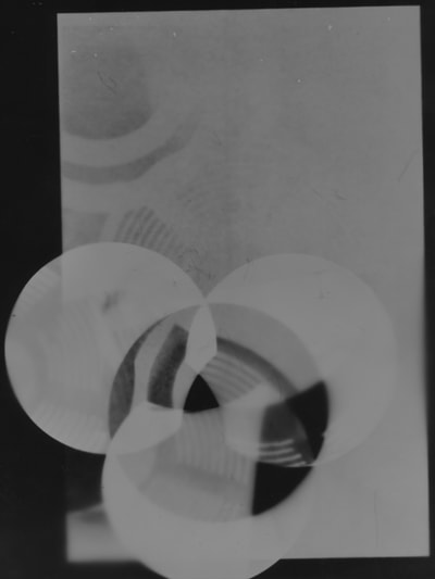
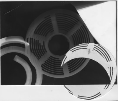
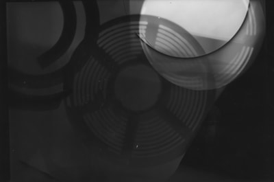
For my final image that I wanted to make with my circular theme, I wanted to combine both of them together with the help of cutting out certain pieces of newspaper and placing them in a way that would create another visual shape.
Duo-tone.
Research.
Ernst Haas.
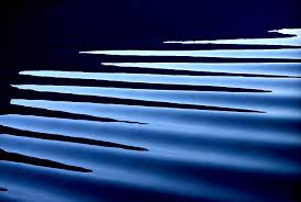
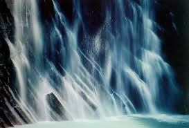
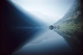
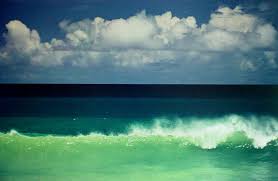
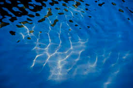
Haas' abstraction photographs involve portraying water in most of them. here are some examples:
Analysis.
these are my two favourite images:

I like this image for its simplicity and how clean the image is. In most photographs you don't see images like this very often, and I like that. The photo is quite mysterious in some ways as in the top right corner you can kind of see the head of what seems to be a swan, and this could of been intensional or just pure luck but either way is adds more to the image.

This picture reminds me of one thing, and that is a sense of calmness. You look at this picture and just feel so calm. In terms of abstraction, this image offers a lot visually and is easy to pick out the parts that separate one half of the image from the other half. A sense of darkness is also within the photo as one side is light, and the left side is completely pitch black, even in broad day light. Quite scary.
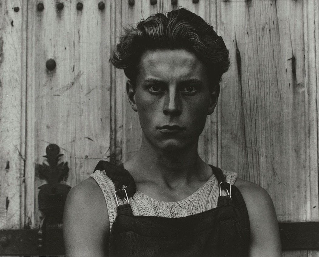
Paul Strand.
I like the work of Strand because he mainly worked in black an white, which is one of my favourite filters. I like the filter because you can take near enough any picture then change the image into black and white and the whole atmosphere of the picture. in a sense it makes it seem 'old' in a way.
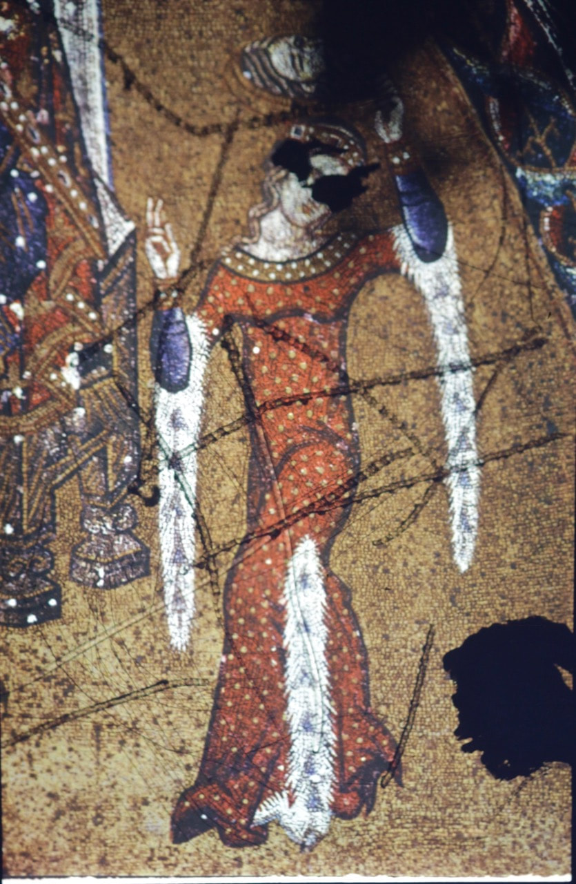
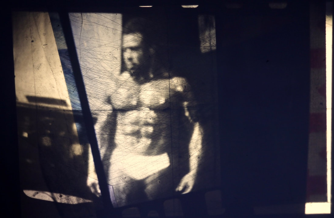
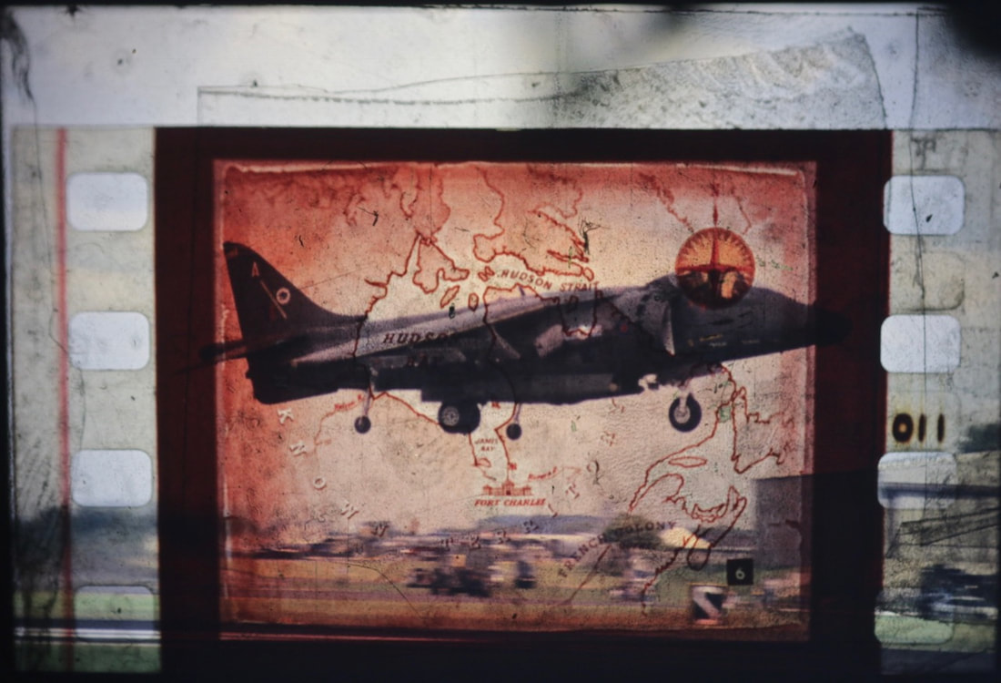
Dafna Talmor Workshop.
In this special workshop, we were introduced to a new technique to make a much smaller image that was originally priced on a type of film and is then tampered with wether that be cut in some sort of way or another image placed on top or behind it. These are some examples of some that I made during: